Radio Buttons vs. Checkboxes — What's the Difference?

September 1, 2021

There is always a rhyme and reason to web desgin.


You might have noticed when building your ballot that ElectionBuddy alternates between using radio buttons:
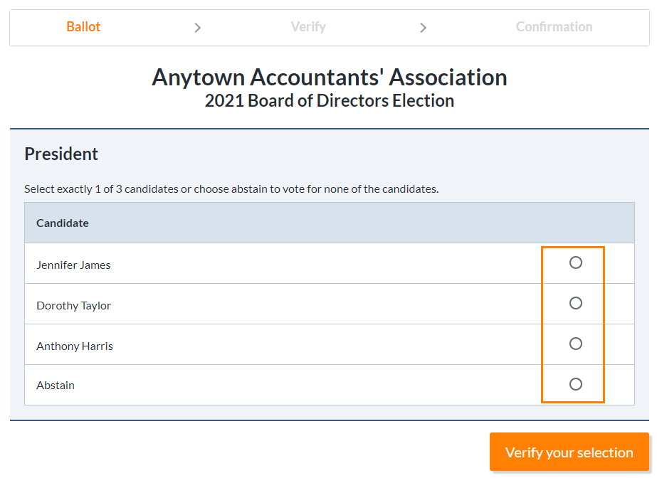
Sample of Radio Buttons

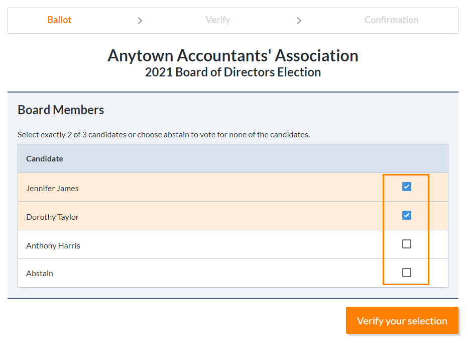
And the use of checkboxes:

Sample of Checkboxes

While it might seem like this design choice is random, it is actually an industry standard when it comes to web design. So, what is the difference between radio buttons and checkboxes?

Radio Buttons

The radio button is a circle that is meant to limit the voter's choices, meaning they can only select one of the presented options/candidates when voting on ElectionBuddy. You can also find radio buttons:

  • During th checkout process where you select one card type or the other. For example, are you using a debit or a credit card?
  • When you choose a delivery option. For example, do you want it delivered now or later?
  • You can also find this used for mutually exclusive options on your food order. For example, do you want a smal, medium, or a large pizza?

Checkboxes

The checkbox is used when there is a range of options and the voters in ElectionBuddy can select more than one option. Places where you will see checkboxes used include:

  • When you mae a hotel reservation. For example, the website asks you to select what type of bed you would be okay with having: single, double, queen, and king. You can select all of the options that you would be okay with and the website will bring back a lost of rooms with your selections.
  • When you order food online. For example, what toppings do you want? Tomatos, onions, mushrooms, anchovies, cheese... you will select all that apply to you.

A Third Option?

There is a third choice where this is a standalone checkbox. This is used for a single option that a user can turn on and off. Places where you will see this used are:
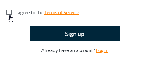
  • When you sign up for a new account. For example, you are asked to agree to the terms and conditions.
  • When you sign up for an account that has a mailing list. For example, you input your email and password and are asked if you would like to receive news and offers from that website.
Third Type

In Conclusion...

Overall, this web design helps guides voters to see what is expected from them when they fill out their ballot. Radio buttons indicate that they can only pick one option/candidate while the checkboxes indicate to them that they can pick more than one option/candidate/ For more information on radio buttons and checkboxes check out this article: Checkboxes or radio buttons? Let the UI design battle commence!

Join 11,984+ organizations like yours that use ElectionBuddy to build more easy online elections

Related posts

Feature Focus: GrowthZone AMS

ElectionBuddy and GrowthZone have teamed up to make managing voter lists easier than ever for organizations wh...

Feature Focus: Third-Party Integration

ElectionBuddy makes managing your voting process easier by allowing you to integrate with applications you alr...

Welcome Voters! 

We’re thrilled to have you here! ElectionBuddy has been in the world of elections since 2008, and over the y...

© 2011-2024 ElectionBuddy, Inc. All Rights Reserved

hello world!
chevron-down